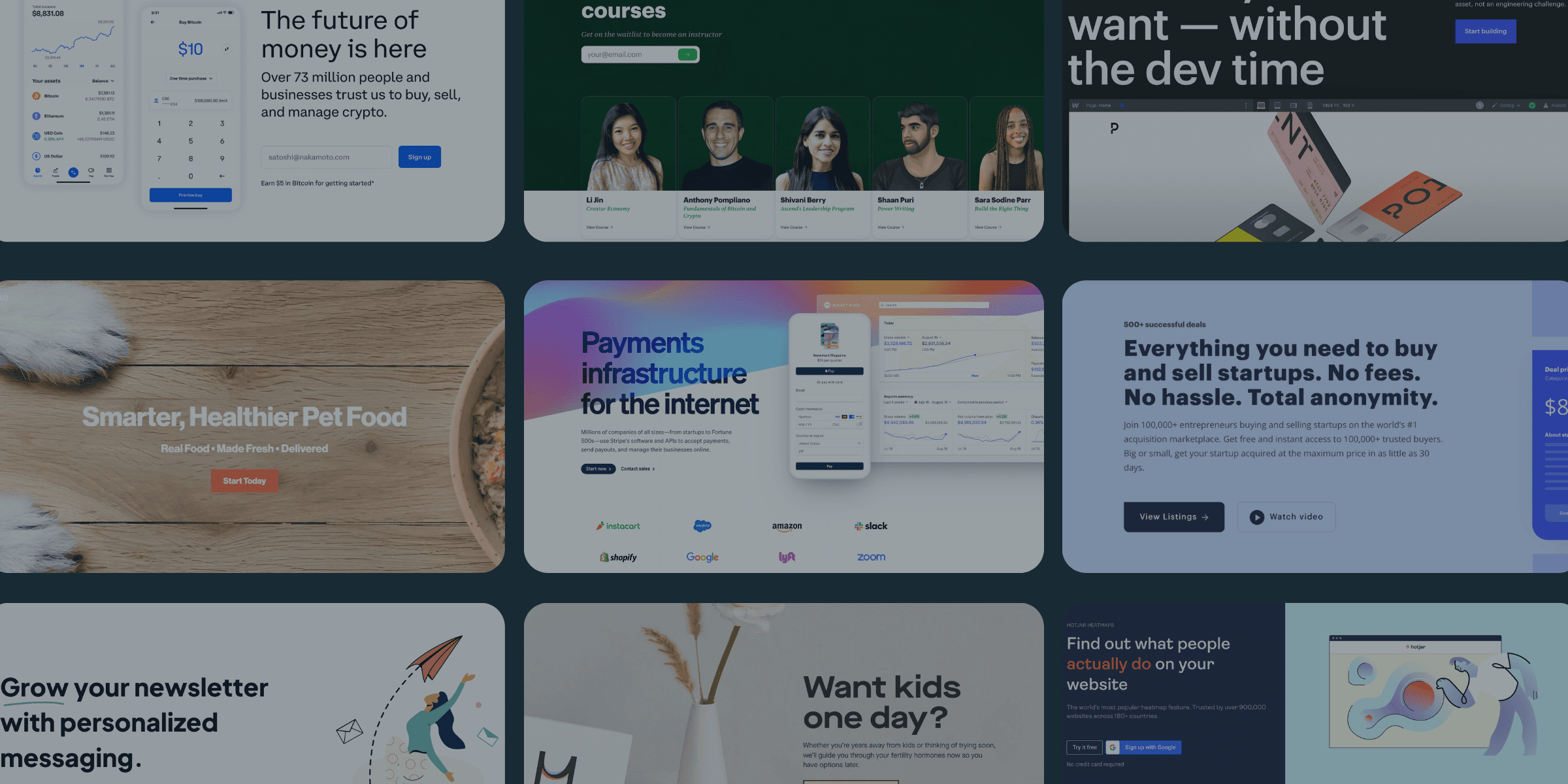
How To Create A Landing Page That Converts Like A Cheat Code
Let's Re-create Your Landing Page
Landing pages are like a handshake when you close a deal. If you don't do everything right prior, you'll never make it to the handshake.
On the other hand, if you nail your prospecting, your pitch, and your close, then you shake hands and close the deal.
And just like your landing page, you can nail the prospecting (targeting), the pitch (ads or content marketing), and miss on the close (landing page), completely derailing your customer acquisition efforts and costs.
Hence, the bottleneck.
And why we want to find it and fix it.
Because you can hit home runs all day long via social, ads, emails, SMS, etc., and strike out nearly every time a consumer clicks through to your landing page.
And if we look at basic math, slight upticks in your conversion rate significantly impact your revenue.
Example:
You own a referral program software. It costs $70 a month. And you average 10,000 visits a month to your landing page with a current 2% conversion rate.

Clarity Is King. Context Is Queen. And Creative Is The Prince.
A high-converting landing page is one that communicates effectively. Where the consumer not only knows what, why, and how you do what you do — but can visualize it.
Why Is Clarity King?
A high-converting landing page is one that communicates effectively. Where the consumer not only knows what, why, and how you do what you do — but can visualize it.
Clarity tells the consumer one thing: What do you do for me?
"When asked what qualities they value most in writing, people who must read a great deal professionally put clarity at the top of their list. If they have to invest too much effort in figuring out the writer's meaning, they will give up in dismay or annoyance." - (Maxine C. Hairston, Successful Writing. Norton, 1992)
Clarity starts with your headlines (more later).
And delivers a clear first impression because the level of clarity will influence persuasion.
Example: SimilarWeb

Why Is Context Queen?
Second in line is context.
Context answers the second question: How do you make that happen for me?
Because without it, your big, bold idea is nothing more than a claim.
In the case of your landing pages, context will be delivered via your sub-headlines and copy.
And always answers, "HOW?"
Example: Substack

Why Is Creative The Prince?
Lastly, the creative elements on your landing pages.
Your creative elements: paint the picture.
Without them, you're letting the consumer's imagination take over.
With them, and you show what you deliver.
It's not enough to just tell, you must show.
Example: HotJar

Don't Design A Landing Page. Write A Letter.
Write A Letter. Then Build Around It.
This headline is some of the best advice I've ever gotten.
You first write a letter to your customer.
Then you build and design around that letter.
So, how do you do this?
The first thing is to understand that every consumer is alone with your words.
You may convert 100 customers a day, but each customer experienced a one-on-one interaction with your business.
So, write for one.
“Don’t address your readers as though they were gathered together in a stadium. When people read your copy, they are alone. Pretend you are writing to each of them a letter on behalf of your client.” - David Ogilvy
Example: Squarespace
Read Squarespace's copy out loud.
You will notice it doesn't feel like a conversation, and instead, like blocks of ideas, grouped together to build a landing page.
Nor does it feel like it's talking directly to you.

Example: PolyWork
This is all the copy on Polywork's landing page.
When you put it all on a doc and read it aloud, it reads like a personal letter.
And as if it's speaking directly to you.

How To Write Compelling Headlines

Every headline on your landing page has a job.
But only one headline is the founder.
It's your bold, brilliant idea that cements your value creation in the mind of the consumer.
Every other headline is a supporting employee to your H1 aka the founder.
Your Above-The-Fold
Your above-the-fold section of your landing page is single handily the most important aspect of your landing page.
It's a pass or fail test with a 3-second shot clock.
Pass it, and you earn the scroll.
Earning the scroll means engaging the consumer, setting the hook, and priming the consumer to get reeled in.
Example: Coinbase

The "Secret Sauce" To Writing An Above-The-Fold Section That Earns The Scroll
To earn the scroll, your above the fold must include these elements:
- A value-focused headline
- A complimentary sub-headline
- A product photo
- Social Proof
- Next Step
When done right, you subconsciously tell the consumer that the value continues.
How To Write Your Headlines
As I said before, headlines can make or break your landing page.
And I have found four formulas to work best.
Here's an example of one:
Formula #1 = Specificity (Big Idea) x Hook (Your Magic Sauce)

Inject Social Proof Above-The-Fold
Nobody wants to feel like the guinea pig.
Consumers want to feel confident in their decision to trust you.
And because you're above the fold holds the most weight — it also must include the proof to back the claim.
Example: HotJar

Putting It Together To Create A Converting Landing Page
1. Obsess over clarity and clearly communciating the value you create.
2. Context defines how you create the value.
3. Your creative paints the picture.
4. Write a letter to your ideal customer then build a landing page around it.
5. Every landing page should focus on selling one idea and only one idea.
6. Your big idea is your main headline and every supporting headline is like an employee.
7. The goal of your above-the-fold is to earn the scroll.
8. Make a bold claim and back it up with ample social proof above-the-fold.


