How To Create An In-Store Experience In E-commerce
To fully experience a brand and its products, customers need to see, touch, and try on products before purchasing. These experiences are mostly only possible with in-person shopping.
However, from a business perspective, the substantial investment required for brick-and-mortar is not plausible for every brand. Most launch with a digital-native business model due to its ease and efficiency.
The compromise, until your growth can sustain brick-and-mortar retail operations, is to build a digital shopping experience that makes customers feel like they are shopping in-store.
Other than cookie-cutter tactics like good copywriting and clear product shots, many brands have created creative ways to give customers immersive experiences once only possible in physical retail.
1. Display Product Size
It’s difficult to grasp the size of products online. The expectation is that most customers would take out a tape measure and read the dimension description, search customers reviews to see how many mention the product is smaller/bigger than they thought, and the number of mentions might be higher than you think.
Soft Services takes advantage of customers’ phones as size references.

On Soft Services’ mobile product page, if you click on the product image and choose “Actual Size”, you can use your phone as a reference and see how big a product is.
A creative and easy solution to display product size — easy once you know it.
Fernish uses AR to let customers view furniture in their own space.

Fernish recreates the in-store interactive experience online through AR. Customers can see how each piece of furniture would look and fit in their home before they make a purchase.
This reduces the cost of showroom displays and helps customers make an even more informed buying decision than shopping in physical stores.
The outcome: happy customers with fewer returns.
2. Allow Product Try-On
Another big obstacle to shopping online is not being able to physically examine or test the product.
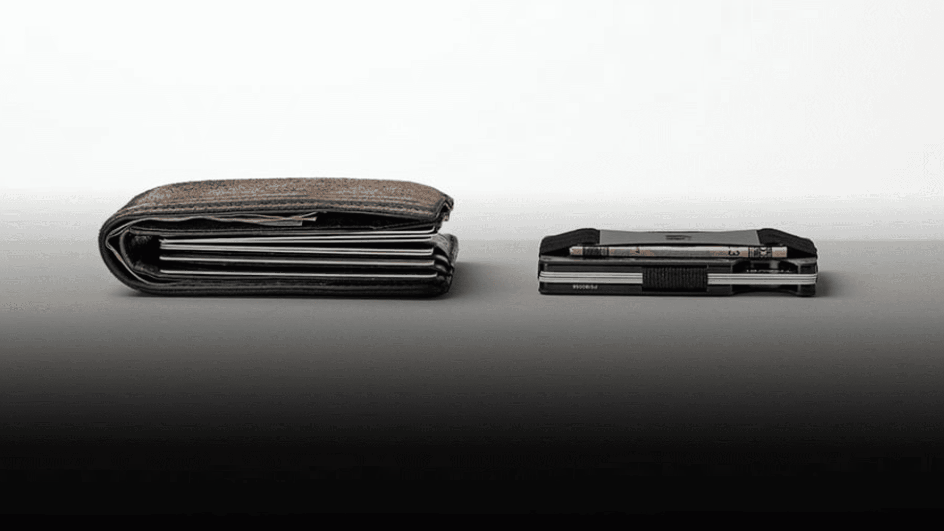
Ridge simulates the product try-on experience through interactive visuals

Ridge wallet’s selling point is its slimness.
How can they show it without customers testing the wallet for themselves?
They recreate the experience through an interactive visual showing how the wallet stays slim with up to 10 cards and some cash.
Then Ridge takes it to another level putting the visual side by side with a traditional wallet, demonstrating Ridge wallet’s differentiation point.
Ridge allows customers to “try” the wallet while also telling a compelling story.
Violette uses AR to let customers try on makeup at home.

Through a live camera or an uploaded photo, Violette customers can see what each product would look like on them, just like what they could do in-store.
Many beauty brands have adopted this technology to bridge the gap between digital and physical shopping experiences.
3. Share Product Specifics
Nuances about products can sometimes only be perceived in person through talking to salespeople or picking up the product yourself.
Learning to better communicate these product details in e-commerce gives customers a boost of confidence in shopping online.
Tower 28 leverages UGC video to do the selling on PDP

On its e-commerce site, Tower 28 puts a video pop-up in the corner of the product detail page and has a customer demoing, swatching, and talking through product benefits, just like a salesperson would in-store.
The information is all available on the page, but a UGC video can instantly capture customers' attention and let them hear the reasons why they should get the product.
Olipop features nutrition facts label on-site

How does a customer shop for food & beverage in the store? They pick up the can, turn it back, and look at the nutrition facts and ingredients.
Many food & beverage e-commerce sites bury this important info in product details that are hard to access. Olipop shows the nutrition facts label and ingredients for each flavor front and center — give it the attention it deserves to help customers make a purchase decision.
The Nugget highlights product color differences under different lighting

Experienced online shoppers know studio lightening in product shots distorts colors. You need to do a series of image searches to see how a product would look under sunlight, indoors, etc.
To solve this challenge, the Nugget sets expectations by showcasing the range of tones their product would have under different lighting.
What would make this good to great is to annotate the lighting used for each image, so customers can have a better idea of what the cushion would look like in their home.
4. Provide Product Recommendations
In a physical store, customers can rely on store staff for product recommendations tailored to their needs. In e-commerce, however, they could spend hours acquiring information to know what products are best for them.
Amika uses quizzes to personalize the shopping experience.

Through conversational quizzes, Amika gives customers personalized product recommendations among their many SKUs while also collecting invaluable first-party data on customers’ needs to further personalize their customer journey.
And A Quick Note
We share these examples for your inspiration. But be mindful that unless you build it yourself, many of the technologies come with a recurring cost.
So pinpoint the pain point that deters customers from having a great online shopping experience by deep diving into customer feedback and reviews.
Test a solution and see if there’s any incremental upside to your KPIs compared to the cost.


